Main content
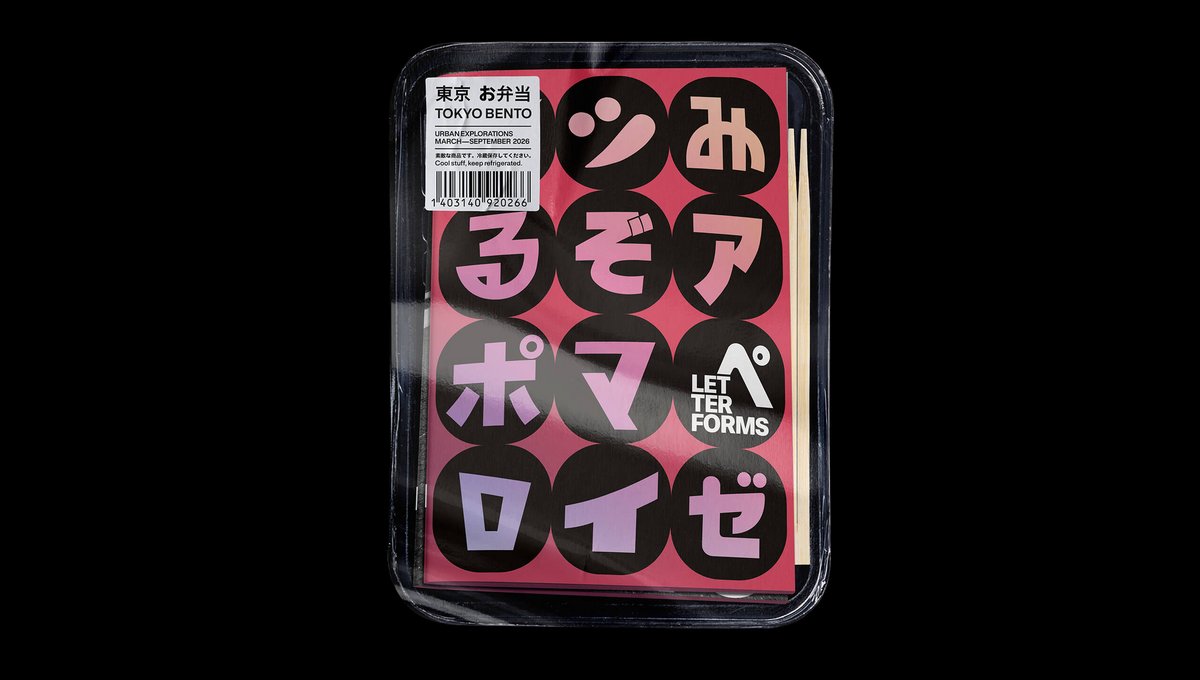
Tokyo Bento: Letter Forms
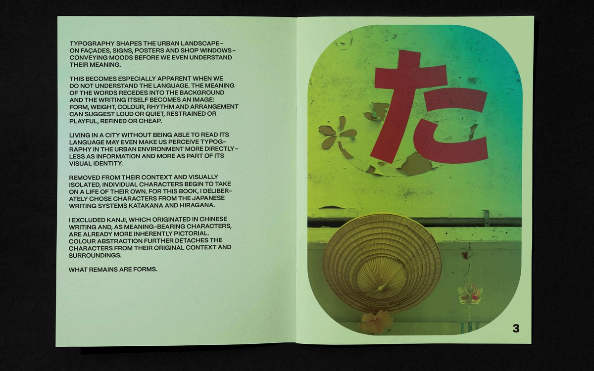
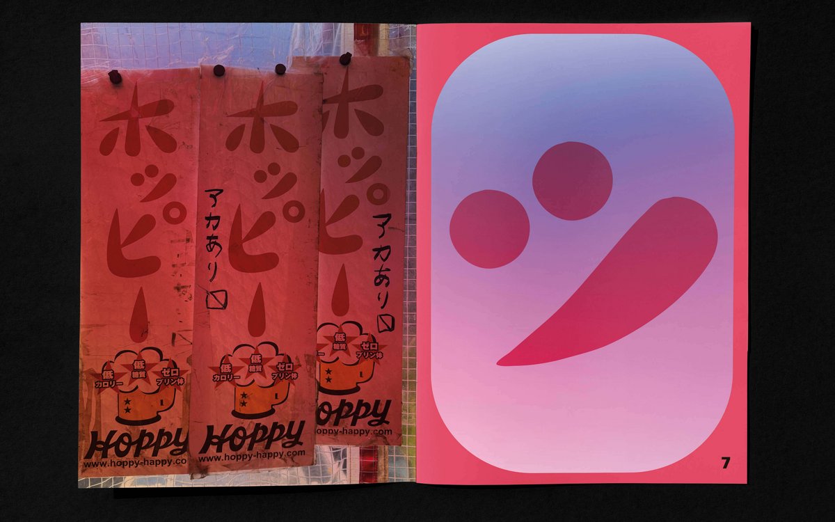
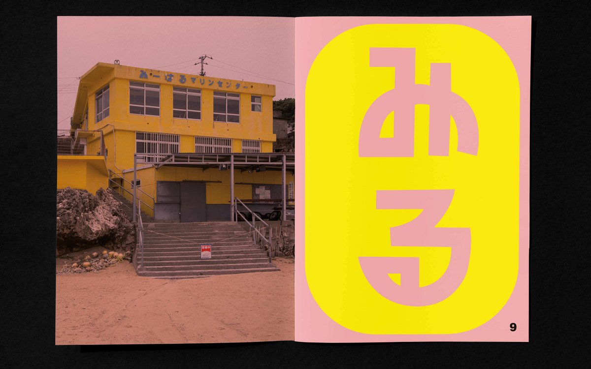
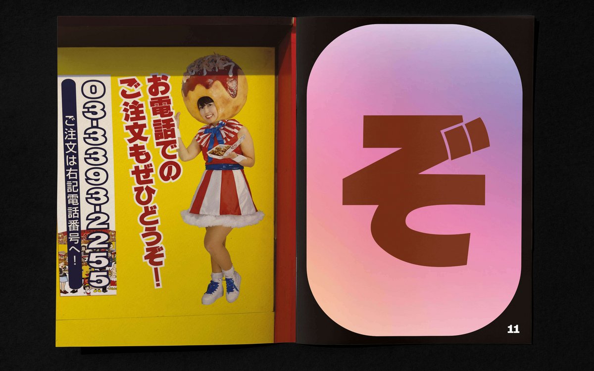
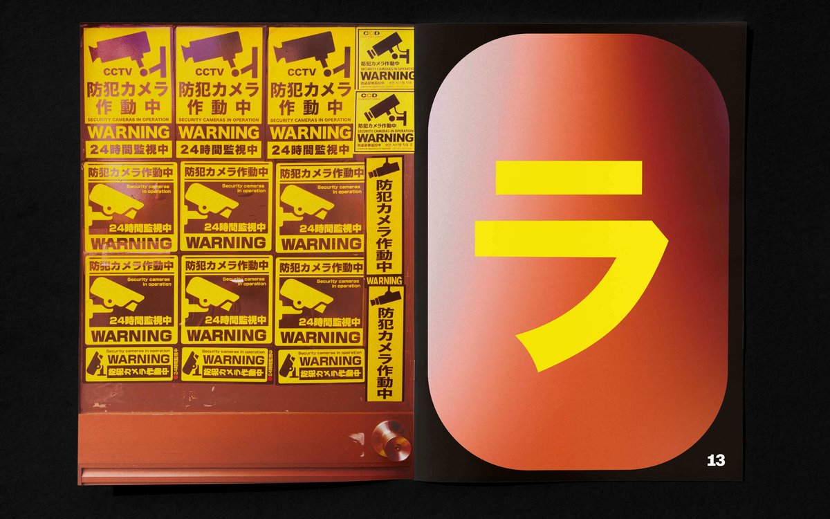
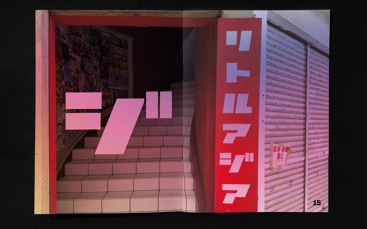
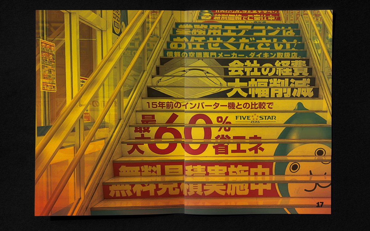
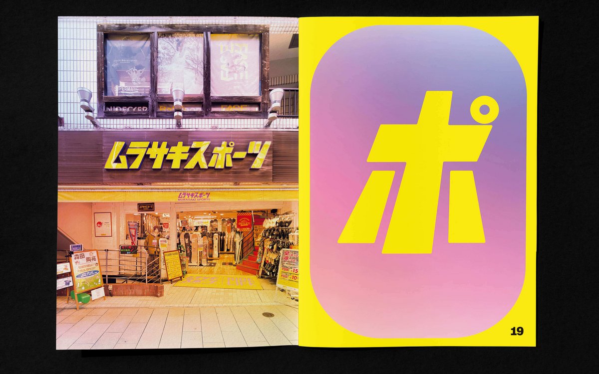
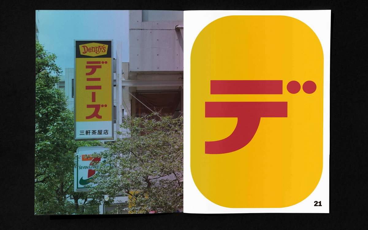
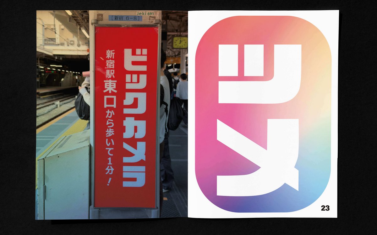
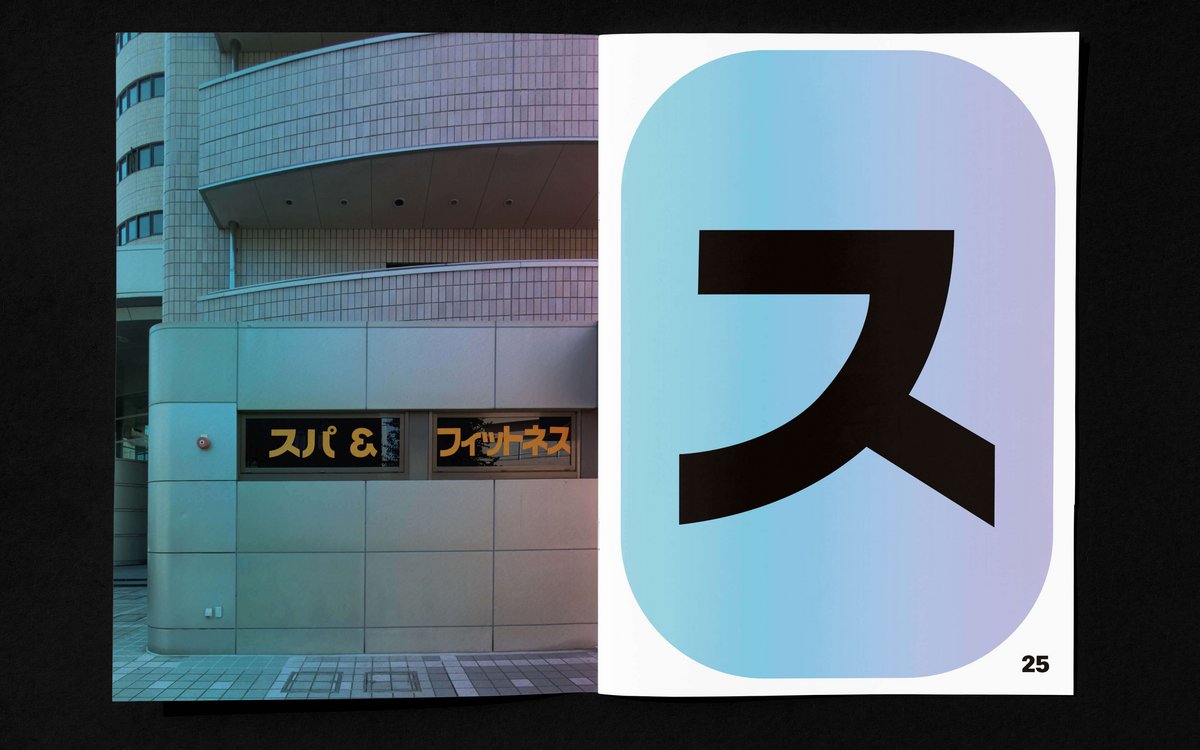
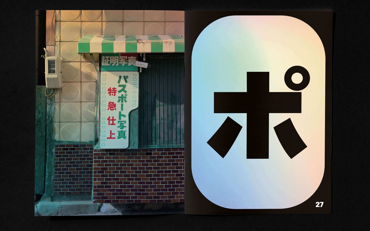
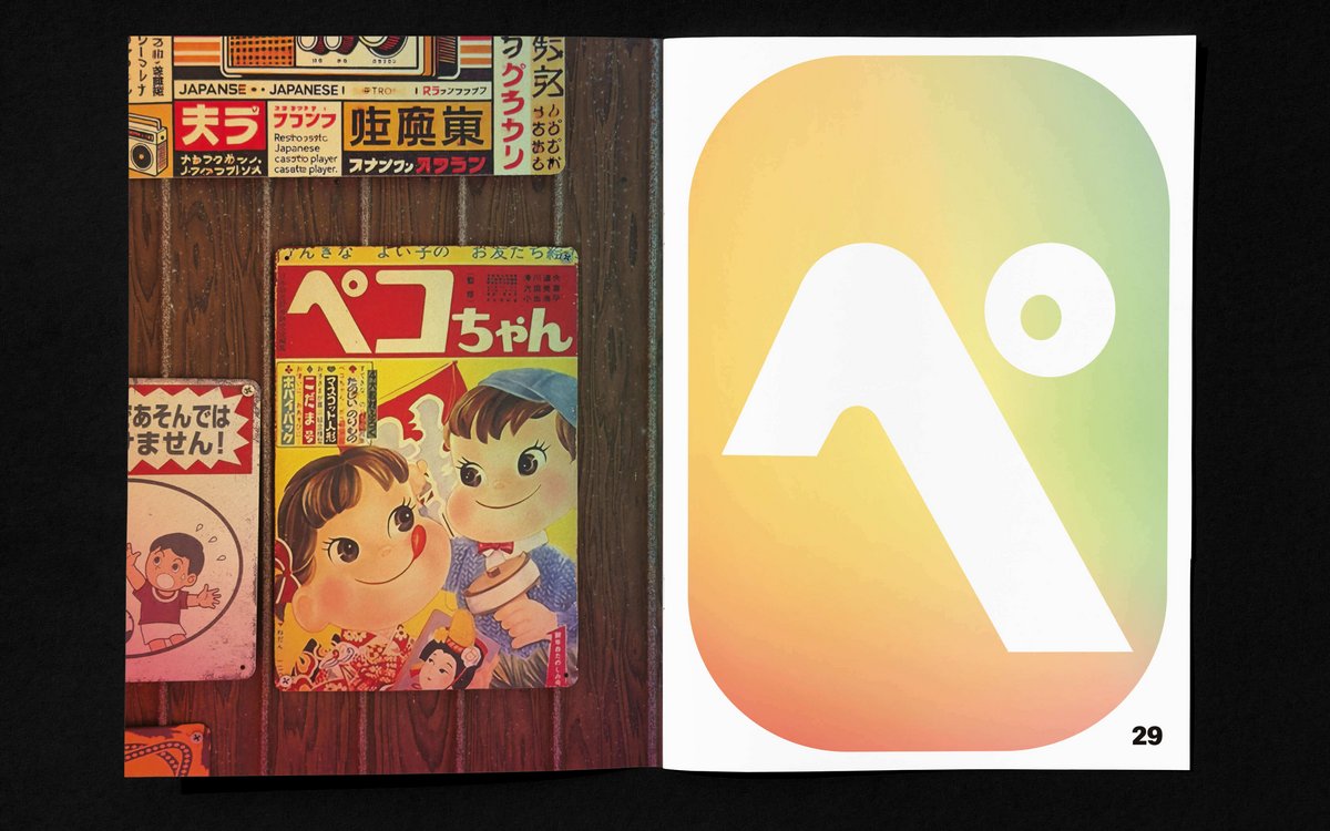
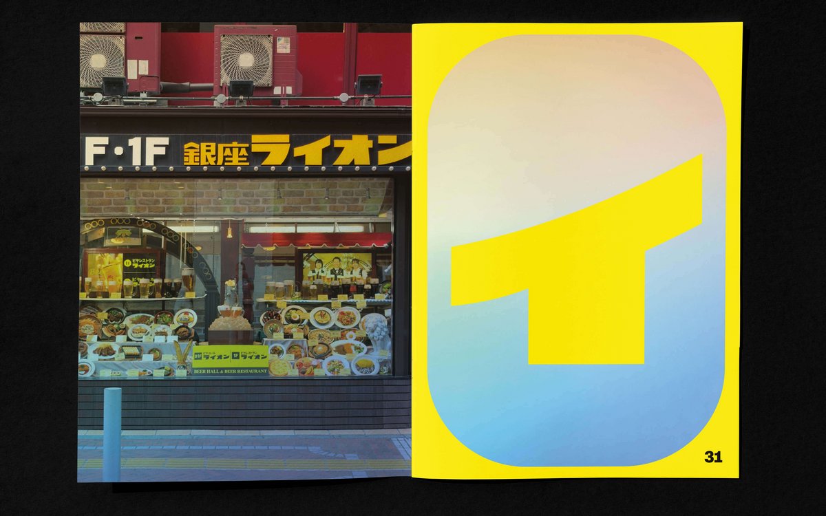
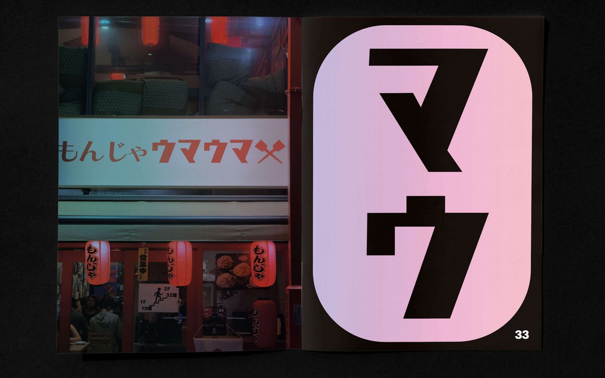
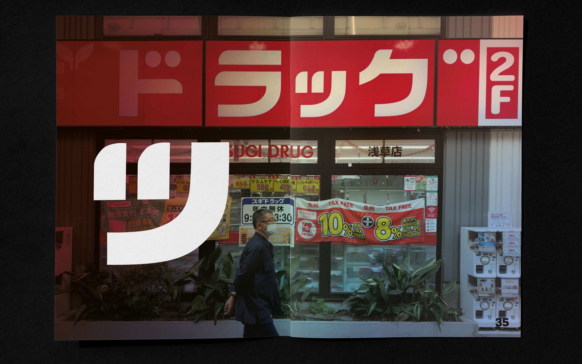
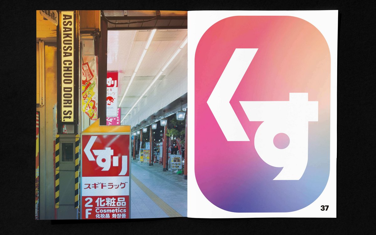
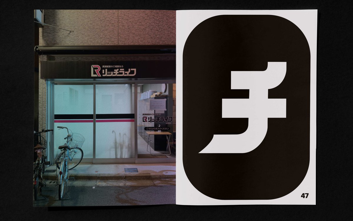
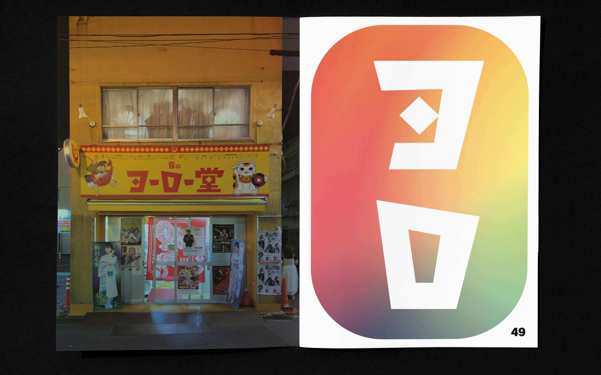
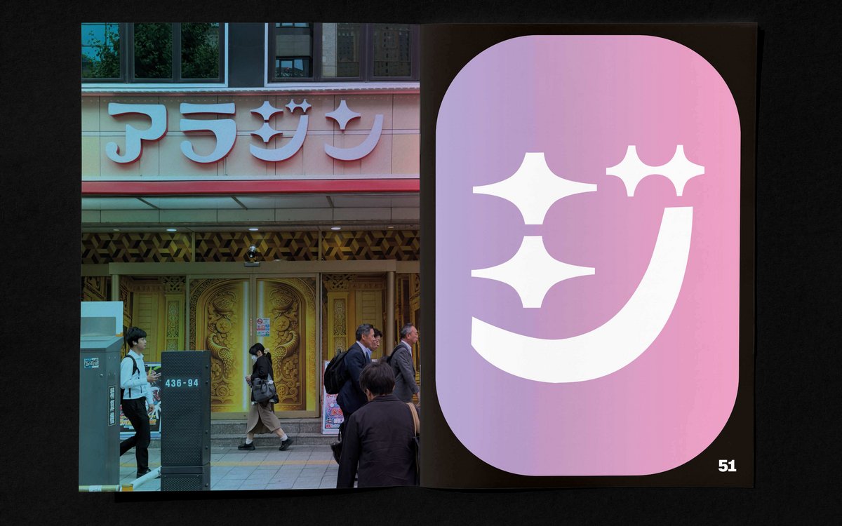
Typography shapes the urban landscape – on façades, signs, posters and shop windows – conveying moods before we even understand their meaning. This becomes especially apparent when we do not understand the language. The meaning of the words recedes into the background and the writing itself becomes an image: form, weight, colour, rhythm and arrangement can suggest loud or quiet, restrained or playful, refined or cheap. Living in a city without being able to read its language may even make us perceive typography in the urban environment more directly – less as information and more as part of its visual identity.
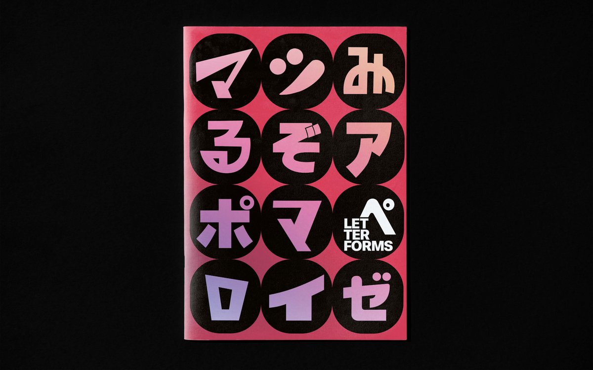
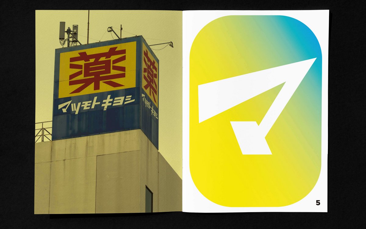
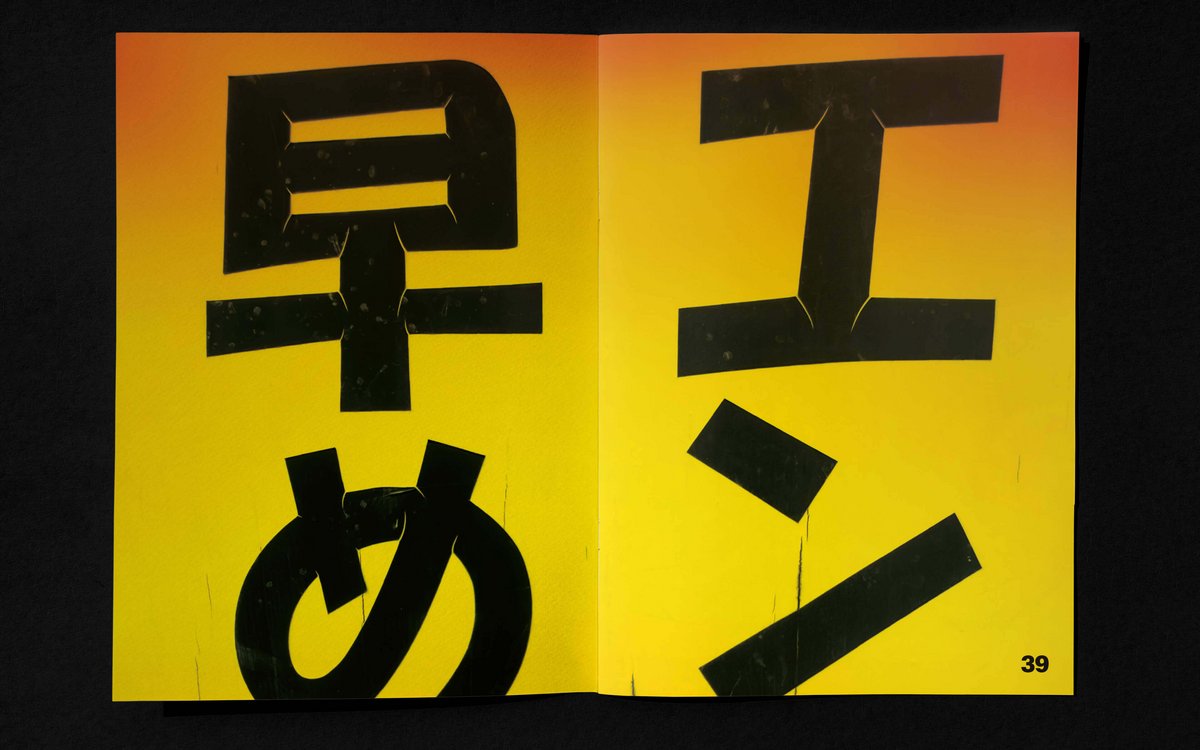
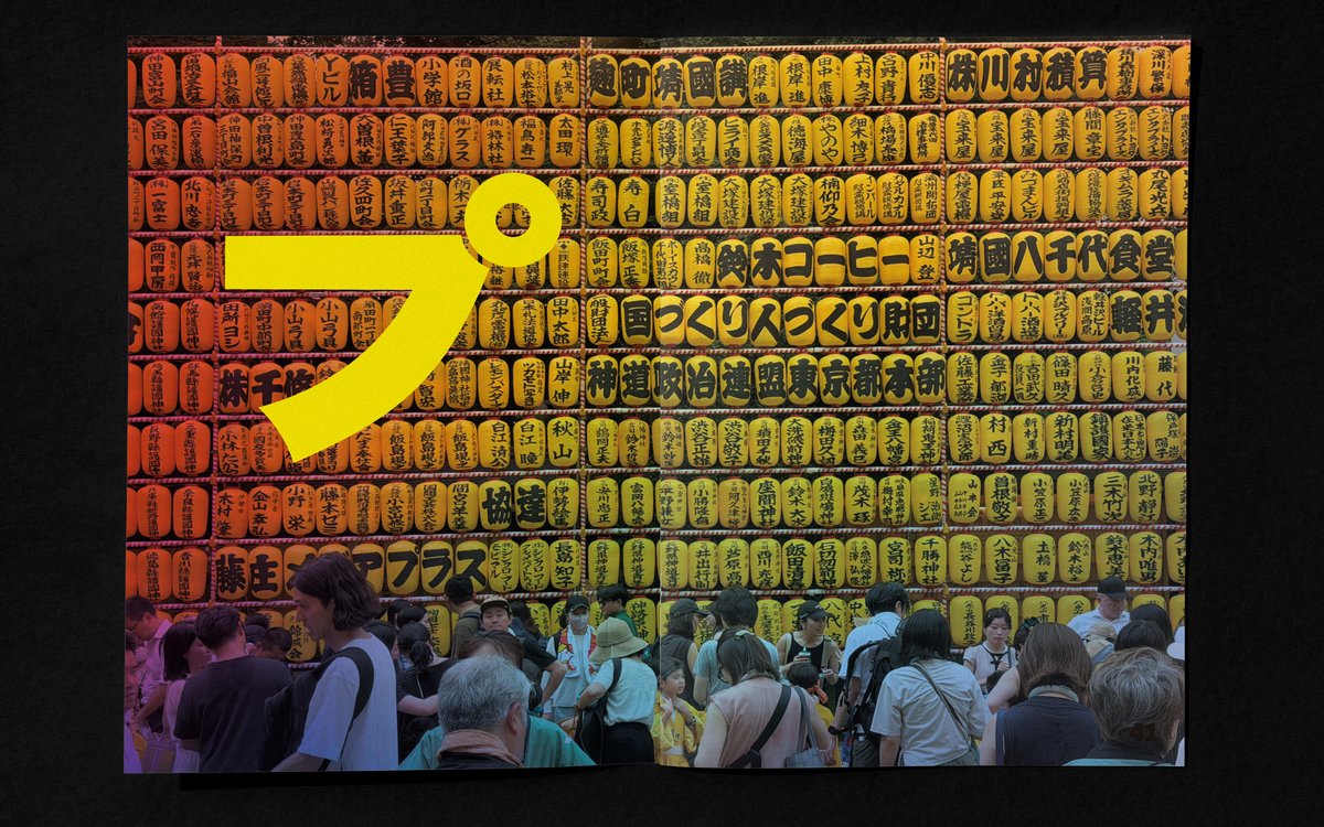
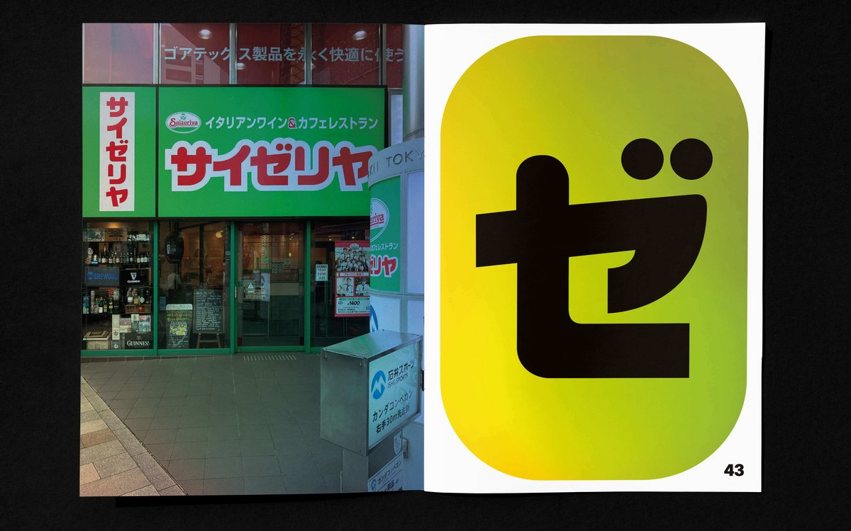
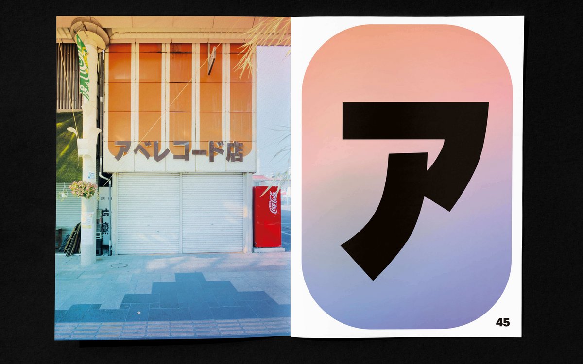
Removed from their context and visually isolated, individual characters begin to take on a life of their own. For this book, I deliberately chose characters from the Japanese writing systems Katakana and Hiragana. I excluded Kanji, which originated in Chinese writing and, as meaning-bearing characters, are already more inherently pictorial. Colour abstraction further detaches the characters from their original context and surroundings.
What remains are forms.
A publication in the Tokyo Bento series
Edition of six zines in a polystyrene sushi container
52 pages, digital print
Print run: 6 copies
2026, printed in Japan
Other titles in the series:
Tape Town
Tokyo Zombie
Reading Tokyo
Tokyo after Dark
Tree Spotting